The Latest
Cargo ships docking at a commercial port incur costs called “disbursements” and “port call expenses.” This might be port dues, towage, and pilotage fees. It’s a complex patchwork and all…

Enterprise
AWS confirms will launch European ‘sovereign cloud’ in Germany by 2025, plans €7.8B investment over 15 years
2 hours ago
AWS has confirmed its European “sovereign cloud” will go live by the end of 2025, enabling greater data residency for the region.

Startups
Indian insurance startup Go Digit raises $141M from anchor investors ahead of IPO
2 hours ago
Go Digit, an Indian insurance startup, has raised $141 million from investors including Goldman Sachs, ADIA, and Morgan Stanley as part of its IPO.

Venture
Food VC Peakbridge has new $187M fund to transform future of food, like lab-made cocoa
3 hours ago
Peakbridge intends to invest in between 16 and 20 companies, investing around $10 million in each company. It has made eight investments so far.

Venture
Accion’s new $152.5M fund will back financial institutions serving small businesses globally
4 hours ago
For over six decades, the nonprofit has been active in the financial services sector.

Meta’s newest social network, Threads, is starting its own fact-checking program after piggybacking on Instagram and Facebook’s network for a few months.

Looking Glass makes trippy-looking mixed-reality screens that make things look 3D without the need of special glasses. Today, it launches a pair of new displays, including a 16-inch mode that…

Replacing Sutskever is Jakub Pachocki, OpenAI’s director of research.

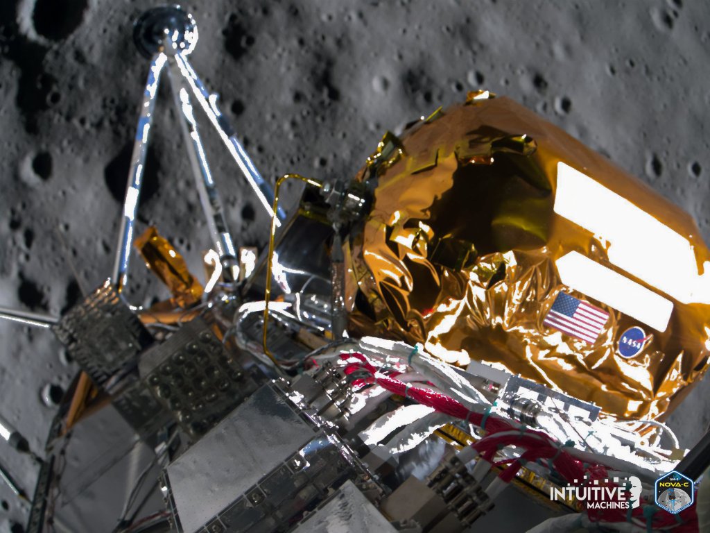
Intuitive Machines made history when it became the first private company to land a spacecraft on the moon, so it makes sense to adapt that tech for Mars.
As Google revamps itself for the AI era, offering AI overviews within its search results, the company is introducing a new way to filter for just text-based links. With the…

Where we’ll be next
Oct 28th
TechCrunch Disrupt 2024
San Francisco, CA
Jun 11th
StrictlyVC – Washington, D.C.
Washington, D.C.
May 21st
StrictlyVC – London
London
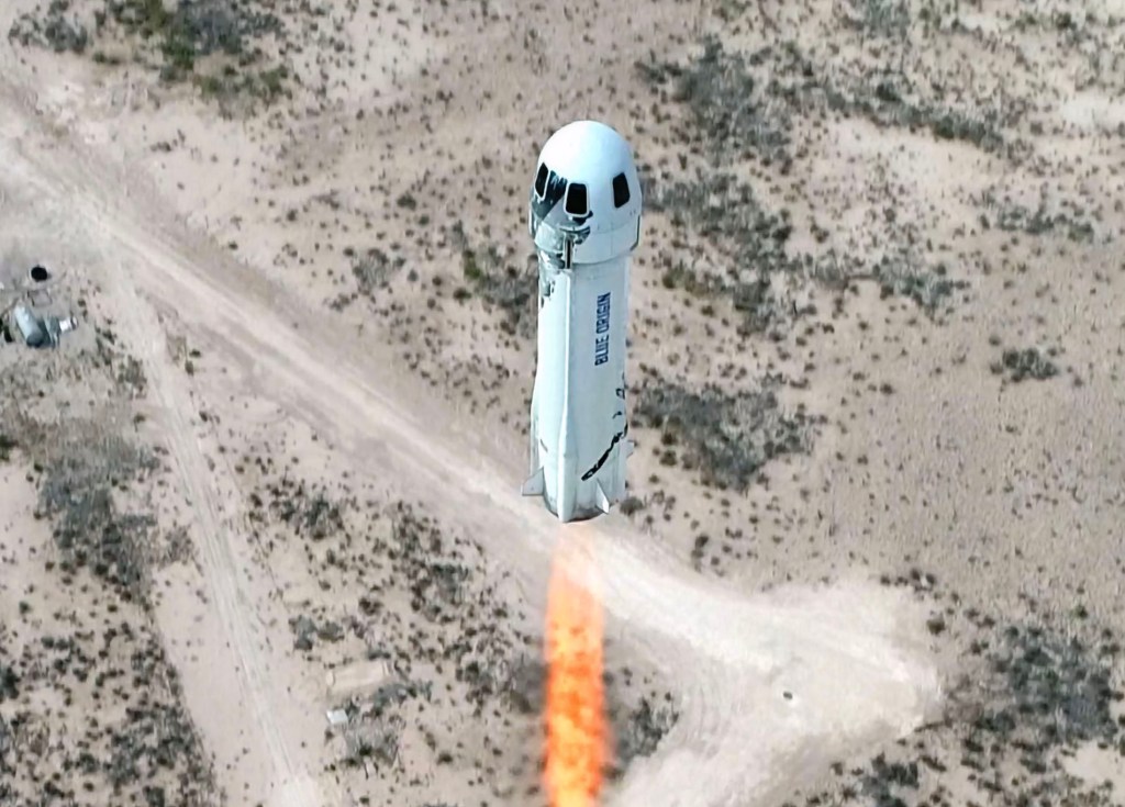
Blue Origin’s New Shepard rocket will take a crew to suborbital space for the first time in nearly two years later this month, the company announced on Tuesday. The NS-25…
This will enable developers to use the on-device model to power their own AI features.

It ran 110 minutes, but Google managed to reference AI a whopping 121 times during Google I/O 2024 (by its own count). CEO Sundar Pichai referenced the figure to wrap…

AI
Google launches Firebase Genkit, a new open source framework for building AI-powered apps
10 hours ago
Firebase Genkit is an open source framework that enables developers to quickly build AI into new and existing applications.
In the coming months, Google says it will open up the Gemini Nano model to more developers.

As part of the update, Reddit also launched a dedicated AMA tab within the web post composer.

Here are quick hits of the biggest news from the keynote as they are announced.

LearnLM is already powering features across Google products, including in YouTube, Google’s Gemini apps, Google Search and Google Classroom.

The official launch comes almost a year after YouTube began experimenting with AI-generated quizzes on its mobile app.

Transportation
Motional cut about 550 employees, around 40%, in recent restructuring, sources say
13 hours ago
Around 550 employees across autonomous vehicle company Motional have been laid off, according to information taken from WARN notice filings and sources at the company. Earlier this week, TechCrunch reported…
