The Latest
The fresh funds were raised from two investors who transferred the capital into a special purpose vehicle, a legal entity associated with the OpenAI Startup Fund.

Accel has invested in more than 200 startups in the region to date, making it one of the more prolific VCs in this market.

Kyle Vogt, the former founder and CEO of self-driving car company Cruise, has a new VC-backed robotics startup focused on household chores. Vogt announced Monday that the new startup, called…

Venture
From Miles Grimshaw to Eva Ho, venture capitalists continue to play musical chairs
3 hours ago
When Keith Rabois announced he was leaving Founders Fund to return to Khosla Ventures in January, it came as a shock to many in the venture capital ecosystem — and…

On the heels of OpenAI announcing the latest iteration of its GPT large language model, its biggest rival in generative AI in the U.S. announced an expansion of its own.…
If you’re looking for a Starliner mission recap, you’ll have to wait a little longer, because the mission has officially been delayed.

Apple devoted a full event to iPad last Tuesday, roughly a month out from WWDC. From the invite artwork to the polarizing ad spot, Apple was clear — the event…

Terri Burns, a former partner at GV, is venturing into a new chapter of her career by launching her own venture firm called Type Capital.
The decision to go monochrome was probably a smart one, considering the candy-colored alternatives that seem to want to dazzle and comfort you.

Hardware
Apple and Google agree on standard to alert people when unknown Bluetooth devices may be tracking them
8 hours ago
Apple and Google announced on Monday that iPhone and Android users will start seeing alerts when it’s possible that an unknown Bluetooth device is being used to track them. The…

Where we’ll be next
Oct 28th
TechCrunch Disrupt 2024
San Francisco, CA
Jun 11th
StrictlyVC – Washington, D.C.
Washington, D.C.
May 21st
StrictlyVC – London
London
The company is describing the event as “a chance to demo some ChatGPT and GPT-4 updates.”

A human safety operator will be behind the wheel during this phase of testing, according to the company.

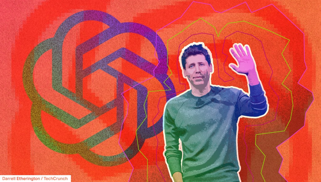
OpenAI announced a new flagship generative AI model on Monday that they call GPT-4o — the “o” stands for “omni,” referring to the model’s ability to handle text, speech, and…

Featured Article
The women in AI making a difference
As a part of a multi-part series, TechCrunch is highlighting women innovators — from academics to policymakers —in the field of AI.
9 hours ago
Government & Policy
White House proposes up to $120M to help fund Polar Semiconductor’s chip facility expansion
10 hours ago
The expansion of Polar Semiconductor’s facility would enable the company to double its U.S. production capacity of sensor and power chips within two years.

Media & Entertainment
TechCrunch Minute: Streaming services are basically just cable now
9:00 AM PDT • May 13, 2024
The streaming world continues its transformation into the new cable bundle. Disney and Warner Bros. Discovery recently announced that they’ll be launching a bundle this…

AI
Google’s 3D video conferencing platform, Project Starline, is coming in 2025 with help from HP
11 hours ago
In 2021, Google kicked off work on Project Starline, a corporate-focused teleconferencing platform that uses 3D imaging, cameras and a custom-designed screen to let people converse with someone as if…

Featured Podcast
OpenAI gears up for a big announcement, and Apple Store workers authorize a strike
Last week was a busy one for some Apple Store employees. Over the weekend, workers at Apple’s Towson, Maryland, store — the first Apple retail store to have a formally recognized union — voted to authorize a strike. While the date of the strike is still being determined, the union has been negotiating with Apple…
8:00 AM PDT • May 13, 2024
Over the weekend, Instagram announced it is expanding its creator marketplace to 10 new countries — this marketplace connects brands with creators to foster collaboration. The new regions include South…
You can expect plenty of AI, but probably not a lot of hardware.
